The psychology of colours and their power
The colours we have around us influence our perception. Ancient civilisations such as the Egyptians or Chinese already thought about the impact of colours, using them as a means of healing.
White: innocence and purity
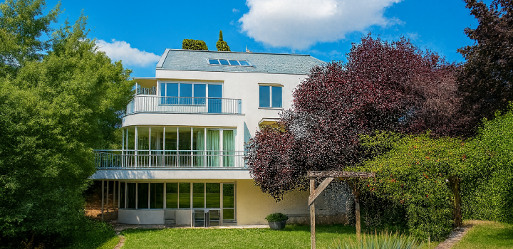
The colour white symbolises innocence and purity. In an interior, it enlarges the space and comes across as sterile and cold. However, complemented by other colour features, it comes across as lavish, delicate and luxurious. People who dress in white are making a statement about their originality, uniqueness and purity of spirit. White is used everywhere where there is a need to draw attention to cleanliness. This is why it will always be used as the main colour by cosmetic salons and clinics. It is also used by luxury perfume and cosmetic brands such as Dior or Channel.
Black: elegance and luxury
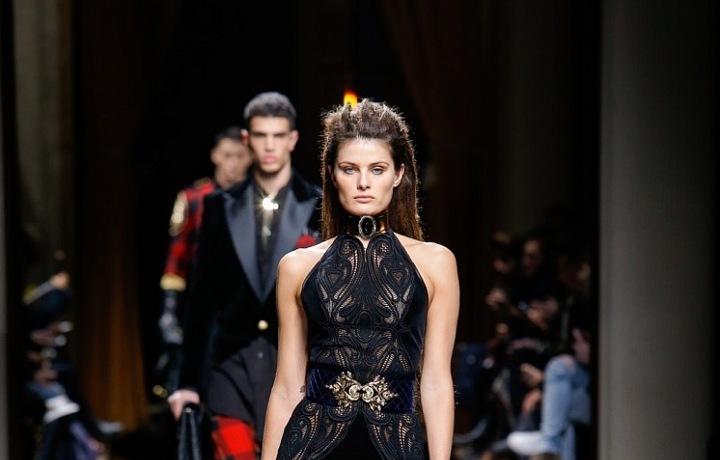
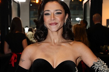
A lot of people regard black as their favourite colour. This is an extreme and elegant colour. It is the colour of mourning and celebration. Desolation and mystery. When used too much, it can evoke a feeling of sadness and bring on a bad mood. It is however also a symbol of power and sophistication. It is used abundantly in the fashion industry due to its unique slimming effect. Black is also a colour which represents luxury to men. This is why you will find it in adverts for luxury cars and on the packaging of luxury products for men.
Red: energy
The colour red is chosen by self-confident people. It is associated with love, fire, energy and passion. People who shun the colour red excessively demonstrate their passivity and exhaustion. Enhance your interior and your wardrobe with a luxury item and draw new energy. This colour is used a lot in marketing as it makes the pulse race and stimulates appetite. This is why food companies and restaurants really like to use it.
Yellow: stimulation
The colour yellow is associated with harmony and a full life. It is sought out by people who are full of expectations and hope. However, due to the large amount of light, it is tiring on the eyes and is not recommended as a colour for use in an interior where people work and create things. It is a colour which attracts attention. You will find it on the packaging of products which are trying to attract you.
Blue: productivity
If you want to deliver higher performance levels in your working environment, choose blue. It incites a feeling of balance and calm. It improves perception and looking at it is satisfying. People who wear blue clothing are revealing about themselves that they lead a rich inner life. Blue means intellect and certainty. This is why it is used by manufacturers of technology for promotion of their products or by travel agencies. On the contrary, you find this the least in the food industry.
Green: peace and nature
The colour green represents growth and a new beginning. It evokes trust and gives off a feeling of peace. It is chosen by people who are not afraid of obstacles, those who long for admiration and acknowledgement. It is also the colour of fertility, representing happiness and health. Green is used a lot in marketing by companies which want to draw attention to their responsible approach to the environment, the freshness and naturalness of their products.


